The web has transformed from static pages to vibrant and interactive experiences. At the core of this transformation are CSS layout tools like Grid and Flexbox, which offer efficient, powerful, and adaptable techniques for designing web content. In this ultimate guide, you’ll learn how to use CSS grid and Flexbox for building responsive layouts with all the tips & techniques explained.
1. Understanding the Basics: CSS Grid Guide & Flexbox
Responsive design is an approach to web design aimed at crafting sites to provide an optimal viewing experience across a wide range of devices. The main idea is to ensure that the layout adjusts based on the device’s screen size, resolution, and orientation.
Flexbox and Grid are both layout models that allow for design concepts that were not possible with older CSS, especially when it comes to responsive design.
2. Flexbox Essentials
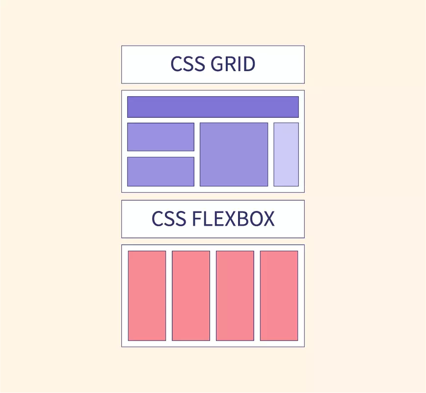
Flexbox, or the Flexible Box Layout, is a one-dimensional layout method. It can deal with either columns or rows but not both simultaneously. Here’s a breakdown:
- Flex Container: The element that sets the display property to
flexorinline-flex. - Flex Items: Direct children of the flex container.
- Main Axis: The primary axis of the flex container. Defined by the
flex-directionproperty.
Key properties include:
flex-direction: Defines the direction of the main axis.flex-wrap: Dictates whether items should wrap onto multiple lines or columns.justify-content: Aligns items along the main axis.align-items: Aligns items along the cross axis.flex: A shorthand for flex-grow, flex-shrink, and flex-basis.
3. CSS Grid Essentials: Guide & Flexbox Differences
CSS Grid Layout provides a two-dimensional layout system, meaning it can handle both rows and columns. Here’s a snapshot: In this ultimate guide, you’ll learn how to use CSS grid and Flexbox for building responsive layouts with all the tips & techniques explained.
- Grid Container: The element on which you set
display: grid. - Grid Items: Direct children of the grid container.
- Grid Lines: The horizontal and vertical lines that divide the grid and separate the columns and rows.
Key properties include:
grid-template-columns&grid-template-rows: Define the columns and rows of the grid.grid-column&grid-row: Place items on the grid.grid-gap: Set the spacing between the grid cells.
4. Designing Responsive Layouts: CSS Grid Guide & Flexbox
To create responsive designs using Flexbox and Grid:
- Media Queries: Use media queries to adjust layouts based on viewport sizes. For instance, switch from a column-based layout on mobile to a row-based layout on desktop.
- Flexible Units: Use relative units like
fr,%,vw, andvhinstead of fixed ones likepx. - Auto-placement in Grid: Let CSS Grid auto-place items based on the available space, making it adaptive.
5. Flexbox vs. Grid: When to Use What?
- Use Flexbox when:
- Dealing with layout in a single dimension – either a row or a column.
- Distributing space between items in a complex way.
- Use Grid when:
- Working with a two-dimensional layout – both rows and columns.
- When you want more control over the placement of items.
6. Best Practices and Tips: CSS Grid Guide & Flexbox
- Mobile-First Design: Start with the smallest screens and scale up.
- Test Across Browsers: Ensure cross-browser compatibility, especially for older versions that might not fully support these properties.
- Use Fallbacks: Use
@supportsrule to provide fallback styles for browsers that don’t support Grid or Flexbox.
Advanced Flexbox Techniques
Building upon our foundation, let’s delve into advanced tactics and applications of CSS Grid and Flexbox. Harnessing these techniques can elevate your web design game significantly.
1. Nested Flex Containers
Flex containers aren’t restricted to a single level. You can nest one flex container inside another. This is particularly useful when building components like navigation bars or multi-level menus. In this ultimate guide, you’ll learn how to use CSS grid and Flexbox for building responsive layouts with all the tips & techniques explained.
2. Flexbox with SVG
Scalable Vector Graphics (SVG) can be combined with Flexbox to create responsive icons and graphics that adapt beautifully across viewports.
3. Ordering Flex Items
The order property allows you to control the sequence of flex items, giving designers a powerful tool to rearrange content without altering the HTML source.
Advanced CSS Grid Techniques: Guide & Flexbox
1. Grid Template Areas
With grid-template-areas, you can visually map out areas of your design, making it more intuitive to place content. This method also makes your code more readable. In this ultimate guide, you’ll learn how to use CSS grid and Flexbox for building responsive layouts with all the tips & techniques explained.
.grid-container {
  display: grid;
  grid-template-areas:
    "header header header"
    "nav main main"
    "footer footer footer";
}
2. Masonry Layout with Grid
While Grid doesn’t support masonry layout natively, you can simulate it by combining auto-fill, minmax(), and some creative placing.
3. Overlap and Layering
Using Grid, you can overlap items and define their stack order with the z-index property. This is fantastic for creating parallax scrolling effects or intricate visual designs.
Combining Flexbox and Grid: CSS Guide
Why choose one when you can have both? Grid is excellent for macro-layouts (like the overall page structure), while Flexbox shines in micro-layouts (like aligning content inside a card).
1. Grid for the Main Layout, Flexbox for Components
Use Grid for the main structure: header, footer, main content, sidebar, etc. Inside these sections, use Flexbox to align and distribute smaller chunks of content.
2. Responsive Components with Flexbox Inside Grid Items: Guide CSS
For components that need to be responsive (like image galleries), you can use a Grid layout but make each grid item a flex container, ensuring the content inside adjusts beautifully based on the available space.
Tips for Seamless Design with a Guide CSS Grid & Flexbox
- Design Tools: Utilize design tools like Firefox’s Grid Inspector or Chrome’s Flexbox Debugger to visualize and debug your layouts.
- Performance: While Grid and Flexbox are optimized, always be mindful of performance. Avoid overly complex designs that can cause lag or stuttering on low-end devices.
- Fallback Strategy: While modern browsers support these features, always have a fallback for older browsers to ensure no user is left behind.
Creating Fluid Animations with Flexbox
1. Animated Flex Order
The order property in Flexbox isn’t just for static designs. Pair it with CSS transitions to create stunning rearrangements:
.flex-item {
  transition: order 0.5s ease;
}
2. Dynamic Resizing with Flex Grow and Shrink
Animate the flex-grow and flex-shrink properties to allow for dynamic resizing of flex items upon user interactions, like hover effects.
3. Align and Justify Animations
Transitions between different align-items or justify-content values can yield engaging shifts in content alignment.
Advanced Positioning with CSS Grid
1. Creating Diagonal Layouts
Using the transform property alongside Grid can produce slanted or diagonal grid cells, offering a fresh perspective on layout designs.
2. Aspect Ratio Maintenance
By combining the grid-template-rows property with viewport units and the padding-top hack, you can maintain a consistent aspect ratio for grid items across various screen sizes.
3. Spanning Across Named Lines
With Grid’s line naming capability, you can specify start and end lines for your items, making repositioning within a responsive design simpler.
Hybrid Layout Techniques: Guide for CSS Grid & Flexbox
1. Sticky Components with Grid and Flexbox
Integrate the position: sticky property in Grid or Flexbox layouts to create headers, sidebars, or other components that stick upon scrolling.
2. Conditional Layouts with CSS Variables and Calc()
Mix CSS variables, the calc() function, and media queries to design layouts that adjust based on user-defined or browser-defined conditions.
3. Microinteractions with Grid and Flexbox
Integrate JavaScript or CSS animations with your layouts to produce small, delightful interactions whenever users engage with elements.
Guide CSS Grid & Flexbox Conclusion
CSS Grid and Flexbox have revolutionized the way web designers approach layout design. With a deep understanding and the right strategies, you can create web experiences that are aesthetically pleasing and functional across all devices.
The post Ultimate Guide to CSS Grid & Flexbox: Building Responsive Layouts appeared first on Visualmodo.


0 Commentaires