A successful website is often judged first by how it looks. The typography is clean and the photography is strong. The colors work together and everything feels polished. For longtime entrepreneur and event producer Joe Blackman, though, that is only part of the equation.
After more than two decades designing live experiences, Blackman tends to look at websites in much the same way he looks at physical spaces. A room can be beautiful and still be awkward to navigate. The same thing happens online. Plenty of websites look impressive at first glance but leave visitors with no real idea what they are supposed to do next.
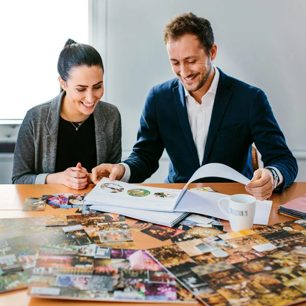
“I think it’s all about harmony and balance,” Blackman says. “When I look at colors, when I look at event spaces, when I look at websites, I’m looking at the balance of how all the aesthetic components come together. Light, color, texture, space and clean lines all play a part.”
It might sound like an odd comparison at first, a ballroom filled with hundreds of guests on one side and a WordPress site being viewed on a phone or laptop on the other. But when you strip away what fills each of them, Blackman sees much the same starting problem.
“There are a lot of similarities between looking at a room that’s empty and looking at a website wireframe where you’re looking at it structurally with nothing in it” he says.
Both give the designer something to work with before any of the more obvious creative decisions have even been made. There is already a shape, a structure and usually some limitations. What happens after that is where things become interesting.
Start With the Structure, Not the Decoration
Walk into an empty event venue and it is easy to start mentally filling it straight away, lighting, flowers, furniture, staging, bars, entertainment and all the rest of it. That is before you have even considered the hundreds of people who might eventually have to eat, drink, talk and move through the room. Blackman starts further back.
“The first decision is often centered around the core structure,” he explains. “You look at the space itself and the first thing you notice is its geometry. Is it a square? Is it a circle? How does the space lend itself to accommodating 300 people sitting for dinner? Where is the evening or late-night entertainment space? Where do people arrive?”
There is an obvious practical side to this. A producer can have hundreds of creative ideas, but some of them simply will not make sense in the room they have been given. Blackman sees something similar when a website starts to take shape. Before deciding on photography, colors or an animation that looks clever in a demo, it is worth asking what somebody actually encounters first. What information matters at that point? Where are they meant to go afterwards? And what happens to all of that once the same design is compressed onto a mobile screen?
WordPress makes that particularly interesting because so much of the process can begin with a template. That is useful, of course, but it can also be deceptive. A template looks convincing in a demonstration because everything in that demonstration was chosen to make it look convincing. The photographs fit. The amount of copy fits. Start replacing those things and the character of the design can change surprisingly quickly. Blackman recently ran into exactly that while looking through templates for a new website he was helping to create.
“They all looked great for the businesses they were originally intended for…” he says. “One was a wedding website, one was a plant company and the other one was a consulting firm. The main issue for me was that I couldn’t see how the overall visual identity, typeface and the structure worked for what I needed it for.”
Anyone who has worked in events will probably recognize the problem. A spectacular venue can still be completely wrong for a particular event.
“If you’ve got a very ornate space but you’re looking to do an event which is really clean and modern, it just takes so much more work trying to undo the current design and features of the room than it does sometimes just to start afresh with more of a clean, blank canvas space.”
That is probably a more useful way to look at a WordPress template than treating it as a nearly finished website. Think of it as the venue. It gives you proportions, a certain flow, perhaps a visual language and some decisions that have already been made.
Blackman describes that as finding harmony within the framework rather than fighting the frame. It is a phrase that comes up repeatedly when he talks about design, largely because he does not see the existing structure as something that necessarily needs to be hidden or overcome.
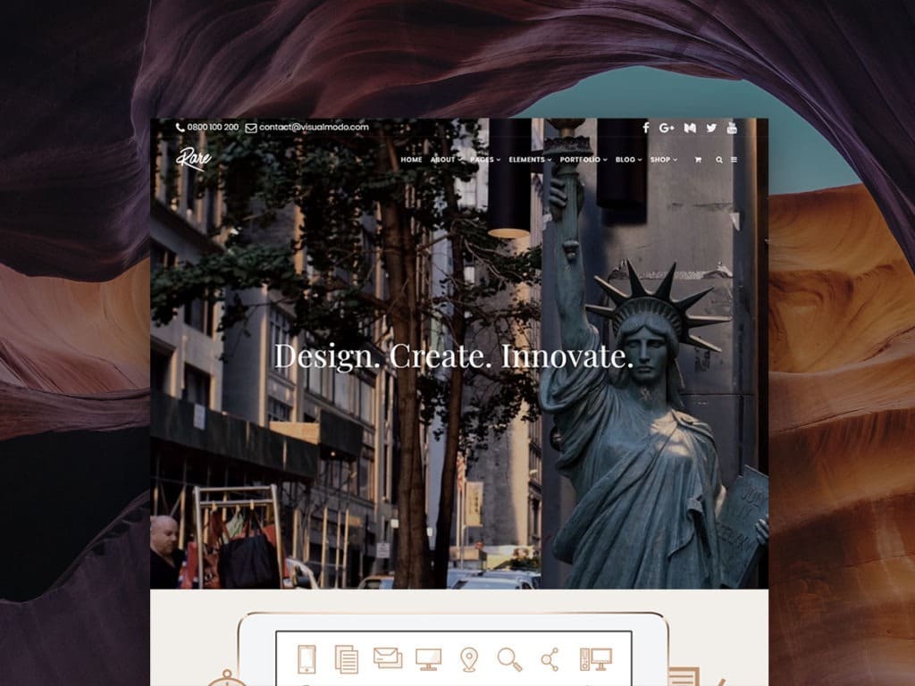
The Homepage is like an Event Arrival
Event producers can spend an extraordinary amount of time thinking about the first few minutes of an event. Guests may only experience the entrance briefly, but those first moments tell them a lot. Where am I? Where do I go? Is this formal or relaxed? Am I in the right place? What happens now?
A homepage has a similar job, although perhaps we do not always think about it that way.
“I think the arrival point is what you first see,” Blackman says. “You look at the menu, you look at a cover page perhaps, and then where do you go next from the cover page. What content is on that? What visual identity does it have? How does it draw you into the next step of the site?”
That idea of drawing somebody in is important to him. At a well-produced event, people do not usually arrive at the front door and then have to independently work out the entire evening. There are cues. Some are obvious, others are barely noticed.
“It has to draw you further into the event and reveal something,” he says. “I always love talking about the element of surprise. The reveal is so important, and so is the journey you take guests on, whether that’s through an event space or through a website.”
Surprise does not mean confusion. In fact, those two things work against each other. You can only fully take in the impact of something thats revealed to you when you are comfortable enough to keep moving towards it. A homepage trying to show every product, every message, every service and every possible call to action can become a wall of information thats overwhelming. Go too far in the other direction, though, and a visitor can arrive on something so minimal that there is almost nowhere obvious to go and then they just leave.
“Sometimes websites or events can be too simple and open. The setup doesnt actually lead you to a specific next call to action on your journey through the website or an obvious place to go” Blackman says.
He sees the same thing happen in physical spaces. “I see it all the time with events – you have people stuck standing in a room mingling by an entrance, but they don’t really know where to go next. This is especially true if a space is quite large. It can be really overwhelming.”
It is not really a question of maximum information versus minimum information. More often, it is about what somebody needs to know at that particular moment.
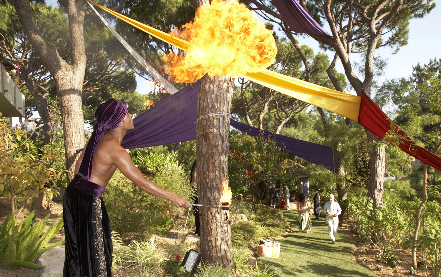
Joe Blackman’s view on navigation
Blackman gives us an example when he talks about wayfinding: the bar. People can enter a venue they have never visited before and fairly frequently work out where the bar is without anybody taking them there.
“People think about the bar as almost like a gravitational point in many events and hospitality spaces” Blackman says. “Why do people go to the bar? Because it’s familiar. It often feels full of energy, busy, and gives you something to do or someone to interact with. Those places kind of stick out in a space.”
There is more design thinking in that than might first appear. Familiarity does part of the work for you.
The same thing has happened online over the past few decades. Joe discussed how people have gradually developed a visual vocabulary for websites without having to consciously learn it. They know roughly what a menu is going to do. They understand a shopping basket as we talked about before. They have expectations about where certain pieces of navigation will appear, and words such as “About,” “Contact” and “Shop” come with assumptions about what is behind them.
“People experience journeys with their eyes,” Blackman says. That presents event and website designers with a slightly awkward tension. Everybody wants a website to feel distinctive, but there is a point where being distinctive becomes making someone learn how the website works before they can use it.
“Some of the worst websites are very abstract and visitors go on there and they don’t really know where to go and get put off sometimes by the quirkiness” he says. He is not arguing for websites to become identical, he advocates for quite the opposite.
“You can reveal quirky or interesting aspects,” Blackman adds. “The fundamental journey, like with events, has to be familiar in ways so it feels comfortable for people. That’s why we see the shopping basket so frequently used – people expect that to be at the top right. They have expectations of where a menu should be. They have expectations around names and titles and whether they can find a quick link to contact information at the bottom of a page.”
Joe Blackman MBE talks about an event in Austin being full of surprises which still had a route through it that made sense. There is no reason a website cannot do the same thing.
Visual Hierarchy Without Shouting
Watch people when they enter a well-designed event and they will often look in the direction the designer wanted them to look without ever being explicitly told to do it. A stage may be brighter than the rest of the room. Furniture can create smaller social areas. Music can shift attention. Flowers, architecture, signage and even where people are standing all change the way somebody reads a space.
Websites have a different set of tools, but they are still directing attention. Typography, contrast, spacing, photographs, scale and the order of information all influence where the eye lands.
Joe prefers that process to feel relatively quiet.
At an event, he might use lighting or furniture to guide somebody without them being particularly aware that they are being guided. Online, type, space, contrast and imagery can do much the same thing.
“It is really about adding in those subtle signs which help guide the eyeline and give subliminal signals as to what may be the next place to go.” he says.
It is an easy problem to create. Make the headline bigger. Make the button brighter. Add another photograph. Add movement. Add another call to action. Before long, all of it is competing and none of it is particularly important anymore.
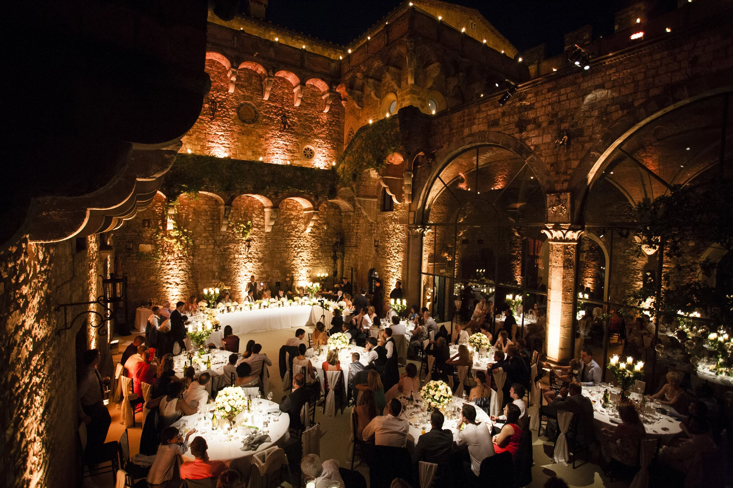
Why Empty Space Isn’t Empty
The instinct to fill space is just as strong in physical design. An empty part of a room can look, well, empty. But event designers know that putting something into every available area rarely improves it.
“I think this ties back to my balance and harmony point,” Blackman says. “Sometimes you need space around things that are important to be able to fully appreciate them in the space themselves. This was often the way many Wonders of the World were designed too. To stand alone and be beautiful in their own right.”
“If you have important parts of a website or photos that are really visually significant to the brand, creating that space, perhaps having more block colors, more of a clear area, simple text, allows people to just focus on that really important detail that you want to put into their minds.”
White space is often described as if it were a technical design device, but most visitors will never think about it in those terms.
When Beautiful Becomes Purposeless
There is also a point where visual sophistication starts working against the experience. Blackman mentions fashion websites in particular, where some brands push minimalism so far that the site can begin to feel detached from what the visitor actually came there to do.
“It looks very clean, very elegant, but it’s almost purposeless.” he says. “There isn’t really anywhere to go. Sometimes you’re wondering what the purpose of the site is. I mean, sometimes I think that about high fashion products in themselves I guess. They can sometimes be beautiful but not usable. So with a website, you can be on there, but you can’t get really clear information. There isnt a clear signal to buy. That can be a real concern when a website is too visual forward, yet not practically considered.”
That is an interesting criticism because the websites he is talking about are not badly designed in the obvious sense. They may be beautiful. The issue is that somebody still has to use them.
Events are no different. One might look extraordinary in photographs, but if feels like it is lacking in atmosphere or is so lound that nobody can hear each other, the aesthetics have only solved part of the problem.
A Template Is an Events Venue
This brings the argument back to templates. A good WordPress template has already made a lot of decisions for you. There are proportions, grids, typography, navigation patterns, content relationships and decisions about how the design behaves on different devices.
“A template can be beautifully built, but if you can’t see your world inside it, it’s the wrong one,” Blackman says.
For anyone looking through Visualmodo’s WordPress themes and templates, that may be a more useful question than simply asking which demonstration site looks best. What matters is whether you can imagine your own content living comfortably inside the same architecture.
Blackman makes almost exactly the same judgment when looking at venues. A room with good proportions and a natural flow gives an event producer something useful to work with.
“You look at the beauty of what’s given to you,” Blackman says, “whether it’s a venue that works really well in terms of its layout and flow, and then be additive rather than feeling like you’re having to recreate and work against it.”
A blank canvas can be useful, but it is not automatically superior. Sometimes a strong existing framework is a much better place to begin.
Nobody Visiting Your Website Is Looking at the Code
Of course, none of this makes the technical side of a website unimportant. A site still has to load properly, behave across devices and make sense to search engines. Hosting, structured data, integrations, responsive behavior and technical SEO all matter, particularly for businesses relying heavily on search visibility. The person visiting the site is rarely thinking about any of that.
Joe laughs and says “the person on the other end isn’t looking at the code, just like they are not looking at all the wiring and backstage technical production at an event!”.
The same visitor who has no interest in a website’s structured data may care enormously whether the site feels trustworthy, whether the page loaded quickly and whether they can find what they came there for.
Designing the Journey and the Outcome
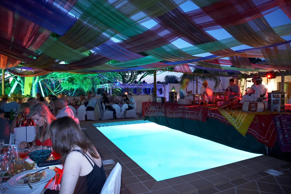
Perhaps the strongest connection that entrepreneur Joe Blackman draws between an event and a website is that neither is really experienced as a collection of isolated design decisions. You can have a look at some of Joe Blackman’s events here.
Events have an arrival point.There are focal moments, periods where things quieten down, transitions, surprises and eventually a departure. A website also has an entry point, some form of navigation, content, interactions and usually an outcome.
“You want people to walk away being genuinely captivated emotionally by their journey through the event, and while it can be difficult to invoke the same emotions on a website, people can still have an excellent experience,” he says.
“People feel happy when they set out to do when they have visited the site and have done so in a time efficient way thats creating value for them. Whether that’s completing a purchase, whether that’s finding the information they want or whether that’s feeling creatively stimulated because there’s some really interesting content that they wanted to read.”
Events have one advantage that websites cannot really replicate. They can work with almost every human sense.
“With events, we often think of the design as a multi-sensory experience,” Blackman explains. “What do people see, feel, touch, hear, smell?. I do accept that this can be a bit more challenging for a website.”
“With websites, they are more two-dimensional (for now!). You don’t have smell, you don’t really have touch, and a lot of websites are experienced predominantly visually. So the visual texture, what you see, really is your primary sense. I have a feeling technology will change that over time”
That makes the visual side of the experience carry a lot of weight. A ballroom and a browser obviously are not the same thing. One involves people physically moving through architecture, surrounded by furniture, sound, lighting, food and other people. The other is pixels, text, photography and code on a screen.
But the questions Blackman asks of them are often remarkably similar.
Where does somebody arrive? What catches their eye first? What do they understand without having to think about it? Where do they go next? At what point do they get confused? What can be taken away? What is worth revealing later rather than immediately? Eventually it comes back to the phrase he started with, harmony and balance.
The technology matters and the architecture matters. So do typography, imagery, navigation, color and all the individual pieces that make up the finished thing. But the person on the other side does not experience any of them separately. They experience the whole journey.
Whether the starting point is an empty ballroom or a blank WordPress website, perhaps the most useful thing a designer can do first is look properly at the framework already in front of them, understand what is working and build from there.
Finding harmony within the framework rather than fighting the frame.
The post From Ballroom to Browser – Joe Blackman Rethinks WordPress Through Event Design appeared first on Visualmodo.






0 Commentaires