Websites are among the most significant digital marketing channels. Besides usability, your website’s design and appearance are crucial to visitors’ first impressions of your business. Check out the best 11 design tips for making a magazine-style website layout, with a guide to craft the top pages.
Designing your website isn’t a simple task. It involves complex processes that require thorough planning and experimentation. The goal is to create a visually compelling design that attracts prospects, provides optimal user experience, and encourages visitors to engage further with your website.
You can make your website appealing with a magazine-inspired web design. But with many creative methods to create a magazine-style website, how can you make one that suits your brand and target audience?
Best Practices for Designing a Magazine-Style Website
Web design has practices ideal for all, but there are methods unique to each business. After all, your brand must leave a significant mark so people can remember you even without visiting your website.
Use these design guidelines to craft a website with the aesthetic of a magazine, enhancing user interaction and promoting brand recognition.
1. Browse for inspirations
Brainstorming a magazine-style layout can be challenging and time-consuming. Rather than spending too much time designing from scratch, browse for inspiration. Inspiration can come anywhere—from books and print magazines to existing websites and templates.
Once you find your sources of inspiration, look for designs that will provide fresh and creative perspectives. For example, mark the pages that pique your interest while scanning a print magazine. Stick post-it notes or tiny bookmarks on each page. These marks will allow you to find them easily.
If browsing websites, take screenshots of the designs and layouts you like and compile them in one folder. Designate a name to separate this folder from others.
2. Understand your target audience
Knowing the latest design trends is one thing, but understanding your target audience is another. Understanding your target audience lets you focus on their buyer personas and preferences.
This practice involves competitor analysis, which enables you to study the competition to re-engineer potential opportunities and leverage gaps where competitors are lacking.
Concurrently, it’s also an opportunity to determine your target audience’s pain points. Suppose your business is a clothing line, and your target audience’s pain point is insecurity about their body shape. Focus on this pain point and make a design that showcases apparel for all body types. Check out the best 11 design tips for making a magazine-style website layout, with a guide to craft the top pages.
3. Choose a magazine-style theme
Choosing a magazine theme might be the easiest way to build a magazine-style website. Magazine themes are well-designed templates that provide readily available elements. These templates help reduce the time spent on manual design.
While magazine-style templates kickstart the process immediately, you can still customize them. Their customizable features allow you to adjust colors, elements, and layouts you wish to change.
They also provide widgets and content categorizers for easy grouping. Whether starting from scratch or doing a redesign, choose one with a user-friendly interface that offers different ways to showcase your content.
4. Ensure a functional page for your content for making a magazine-style website
Users typically visit magazine-style websites with the primary purpose of browsing content. This is why paying attention to your web pages is essential when designing your website. You must ensure they’re functional and allow visitors to easily navigate sections and browse content.
When arranging elements and content, ensure they’re not congested on one page. Treat your web page like a magazine spread and branch these elements out. For instance, create separate sections and emphasize different types of content, such as calls-to-action (CTAs) and informative articles based on your brand.
Take a look at the example below:

5. Go for a bold color
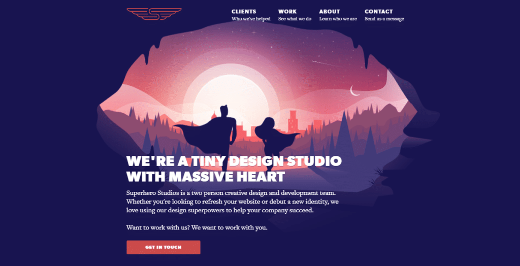
Another simple tip is to go for bold colors. These colors convey strong messages in an energetic, vibrant, and eye-catching way. They can be the main elements or be combined with monochromatic schemes for compelling visuals. Combinations are usually more pleasant than completely vibrant palettes.
Make a single color pop on a monochrome page. For one, mix a bold red with a black, gray, and white background. See example below:

6. Create illustrative graphics for uniqueness for making a magazine-style website
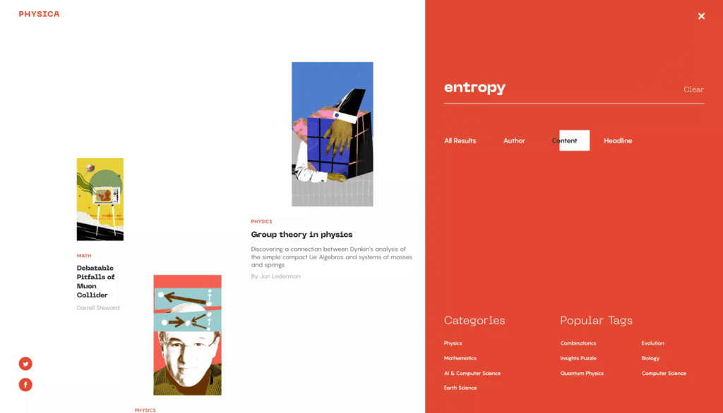
Illustrations can bring uniqueness and more interest to your magazine-style website. Whether hand-drawn or vectorized, these graphics can add a distinctive quality that establishes your brand style.
You can add your personal touch to these elements to develop more of your brand’s identity, making your website more memorable. Illustrations are also a way to express abstract concepts. These concepts are ideal for fashion and lifestyle niches.
The example below shows an illustration in a magazine-style website:

7. Opt for a minimalistic design
Simplicity is ideal if you don’t prefer outlandish designs. Even the most minimalistic design can be visually appealing for some users.
Minimalism concentrates on essential elements, enabling you to prioritize the details that matter most to your brand. Every component and layout has its own purpose. When done right, you can achieve simplicity that entices users to explore your website.
Another advantage of minimalist web design is its straightforward approach. The design process isn’t necessarily complex, allowing you to optimize page speed and mobile-friendliness for a better user experience.
Here’s an example of a minimalist magazine-style web design:

8. Use photographs as the main attraction for making a magazine-style website
Don’t put stunning photographs to waste—use them as your website’s main attraction. Just because it’s a common practice doesn’t mean you can’t use them to stand out. After all, photos can still entice visitors to navigate your website and explore your content.
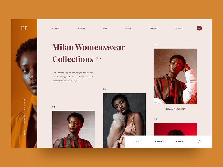
Photographs are primarily used as homepage covers. Examples include landscapes, portraits, and still-life images. Don’t be afraid to make your cover image large. Use it to cover half or the entirety of your page. You can even make a collage to create more visual interest.
Here’s an example of a website that uses a photograph as a cover image:

Collage style:

9. Select the appropriate typefaces. Making Magazine-Style Website
Text is part of your website’s visual appeal. You must select the appropriate typefaces to ensure mobile-friendliness. These fonts should also be pleasant on the eyes.
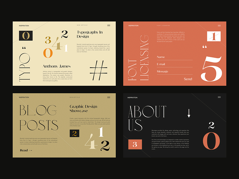
Consider multiple fonts that complement each other for your web pages. Use different fonts for the article titles, headings, paragraphs, and CTAs.
Moreover, besides being easy on the eyes, they should be readable and blend well with the background.
The example below illustrates a website design that uses complementary typefaces: Review design tips for making a magazine-style website layout, with a guide to craft the best pages.

10. Take advantage of the grid layout
Grid layouts are designs that use vertical or horizontal lines to display content visually. These structures are primarily used for homepages. Images are paramount to these styles, so you must use compelling ones for the thumbnails.
Here’s an example of a website with a grid layout:

11. Experiment with different styles and designs
Web design is not a one-size-fits-all approach. Some templates and designs may not be suitable for your website. Although it can be time-consuming, experimenting with different styles is necessary to find the best magazine-inspired layout to represent your brand using design tips for a magazine-style website.
Make a Magazine-Style Website That Converts
Ultimately, the design of your magazine-style website is up to you. The tips above will help facilitate a seamless and less stressful process. Follow them to create a website that converts prospects into valuable customers and drives significant business growth for your magazine-style layout following this guide.
The post 11 Design Tips for Making a Magazine-Style Website appeared first on Visualmodo.

0 Commentaires