App store screenshots are often treated as simple product images, but they have a bigger job. They need to help users understand what an app does, why it matters, and whether it is worth installing. In this article, you’ll learn how to turn app store images into a clear product story with the app screenshot generator. For designers, marketers, founders, and product teams, that means screenshots should not be built as isolated images. They should work together as a clear product story.
Why raw screenshots are not enough
A raw app screenshot shows the interface, but it does not always explain the value of the app.
A new user may not understand what they are looking at, which feature matters most, or why the screen is useful. This is especially true for apps with dashboards, reports, workflows, settings, or multi-step actions.
Store images need to give context. Captions, device frames, backgrounds, visual hierarchy, and screenshot order all help turn raw screens into a more useful story.
Start with the user’s question
A good screenshot set should answer simple questions quickly:
- What does this app do?
- Who is it for?
- What problem does it solve?
- What is the main benefit?
- Can I trust it?
- What happens after I install it?
Each screenshot should have one clear purpose. The first image might explain the main benefit. The second might show the core feature. The third might show a workflow. Later screenshots can add proof, personalization, integrations, or advanced features.
This order matters because many users will only look at the first few images before making a decision.
Captions turn features into benefits
Captions are one of the simplest ways to make app store images clearer.
Instead of using plain labels like “Dashboard,” “Reports,” or “Notifications,” teams should write captions that explain user value.
For example:
“Track progress from one dashboard”
is stronger than:
“Dashboard”
The app screen still shows the product, but the caption explains why the screen matters.
Design for clarity, not decoration: App store images screenshot generator
Good app store screenshots do not need to be overloaded with effects. They need to be readable, consistent, and easy to scan.
Designers should focus on:
- Clear headline placement
- Readable text on mobile screens
- Consistent device frames
- Strong contrast
- Balanced spacing
- Brand styling that supports the message
- Layouts that work across different screenshot sizes
The goal is to make the app feel polished while keeping the product easy to understand.
Localization and testing add complexity: App store images screenshot generator
Once a screenshot set works in one language or format, the work is not necessarily finished.
Captions may need to be translated. Text length can change. Right-to-left languages may need layout adjustments. Different markets may care about different features. Teams may also want to create ASO variants to test screenshot order, captions, colors, or value propositions.
This is why app screenshots should stay editable after launch. A one-off design file can become hard to manage once the team adds new markets, new campaigns, or new product updates.
A repeatable workflow helps
A better workflow starts with real app screens, then builds a clear story around them. Teams can choose the most important screens, add benefit-led captions, apply brand styling, prepare localized versions, and export the correct assets for App Store and Google Play.
Tools like AppScreens can help teams turn real app screens into polished App Store and Google Play screenshots from one editable project, with templates, AI-assisted captions, device frames, brand styling, localization support, ASO variants, and store-ready exports.
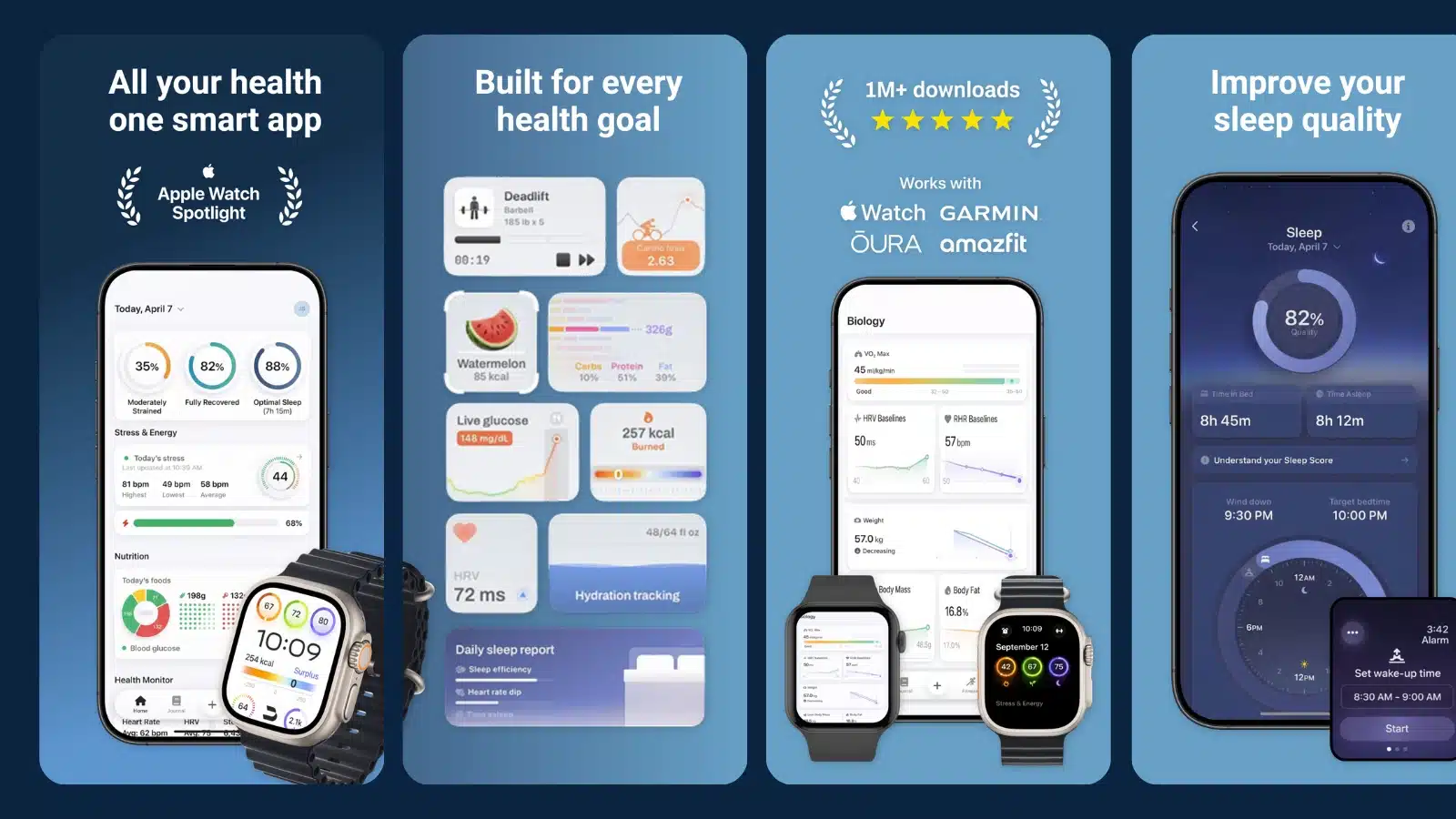
This kind of workflow is useful because store images are rarely finished forever. They need to change when the app changes, when a new feature launches, or when a team wants to test a different screenshot message.
Keep future updates in mind
App store visuals should be treated as reusable assets, not one-time images. A product update, UI refresh, new market, or campaign can quickly make older screenshots feel outdated.
This is where AppScreens can help beyond the first export. Teams can update real app screens, refresh captions, create localized versions, and export new screenshot sets without starting from scratch each time.
Final checklist: App store images screenshot generator
Before publishing app store images, check that:
- The first screenshot explains the main value
- The screenshot order tells a clear story
- Captions focus on benefits, not labels
- Text is readable on mobile
- Visual style is consistent
- Localized versions still work
- Files are ready for store upload
- The project can be updated later
App store images should do more than show what the app looks like. They should help users understand the product quickly and feel confident enough to install it.
The post How to Turn App Store Images Into a Clear Product Story appeared first on Visualmodo.




0 Commentaires