A polished app can take months to design, build and refine. But when it finally reaches the App Store or Google Play, much of that work has to communicate its value through only a handful of images.
That is why strong store screenshots should not feel like exported screen captures. They should feel like a continuation of the product itself.
The best screenshot sets combine real interface design with clear messaging, visual rhythm and enough context to help someone understand the app before installing it.
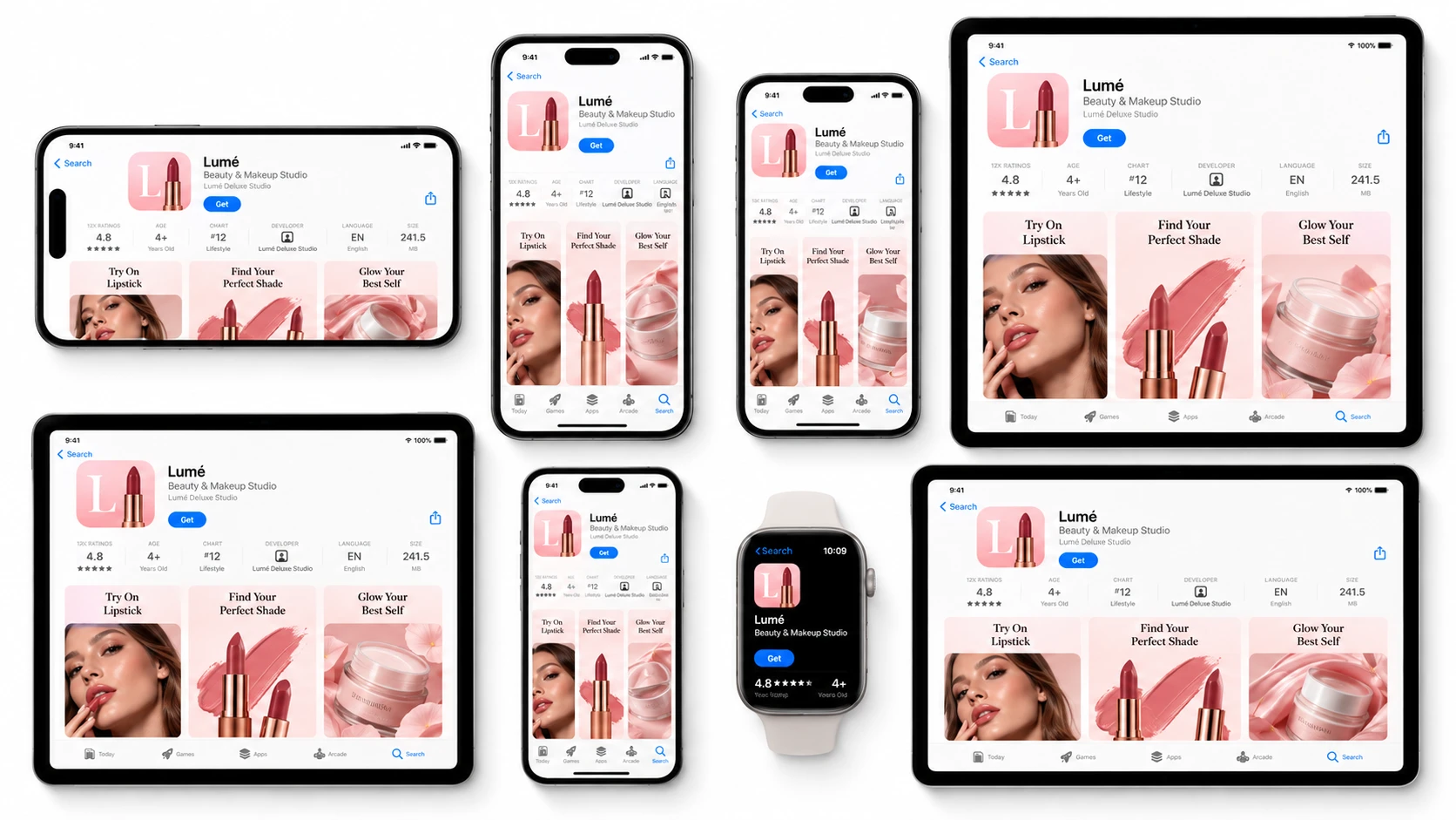
Start With the Product, Then Build the Story
A raw screen is useful because it shows the real product. But on its own, it may not explain why a feature matters.
Store-ready creative adds that missing layer.
A headline explains the benefit. A device frame gives the screen context. Backgrounds, spacing and typography connect individual screens into one campaign.
The result should never hide the app behind decoration. Instead, every design decision should make the real interface easier to understand.
A strong first screenshot can introduce the core promise. The next can reveal the main workflow. Later screens can highlight different use cases, deeper features or supporting benefits.
Seen together, the set becomes a short product story.
Build the Entire Screenshot Set as One System
Creating screens one at a time often creates inconsistencies.
Typography shifts. Device sizes change. Spacing feels slightly different. One screen becomes highly visual while another looks almost like a raw capture.
A better approach is to create the full set as one visual system.
For teams that want to move from an app brief and product screens to a coordinated App Store and Google Play presentation, StoreScreens.ai brings the screenshot workflow together in one place.
The advantage of this approach is not simply speed. It is consistency.
Instead of rebuilding the visual language every time a new screenshot is needed, teams can work from one coherent direction and keep the entire store presence looking intentional.
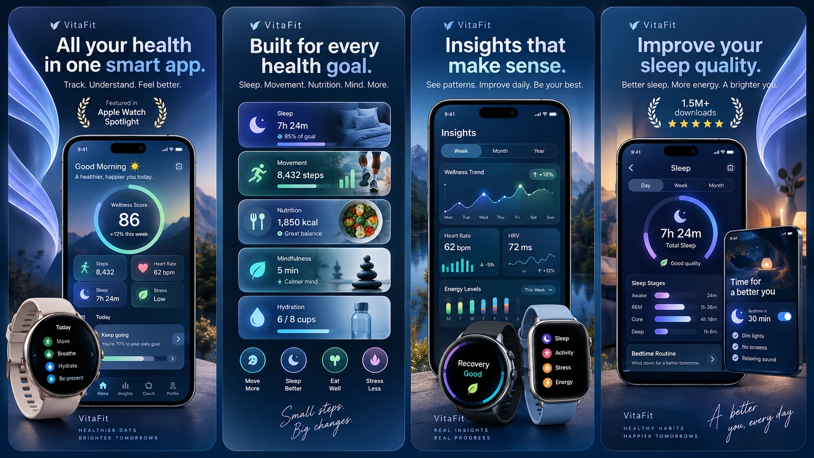
Give Every Screenshot One Clear Job
A store screenshot should be easy to understand within seconds.
That becomes harder when every image tries to communicate five ideas at once.
The strongest sequences usually give each frame one purpose.
One might introduce effortless planning.
Another could show collaboration.
The next may focus on personalization.
A later screen can demonstrate deeper functionality for users who continue exploring.
Benefit-led headlines are especially useful here because they explain why the interface underneath matters.
“Reports” identifies a feature.
“See your progress at a glance” communicates the benefit.
The product remains real, but the message becomes much easier to scan.
Design Across Devices Without Losing the Identity
Modern app teams may need assets for different iPhone sizes, iPad, Android phones, tablets and other device presentations.
Simply stretching one design into another format rarely produces a premium result.
The visual system should stay recognizable while the composition adapts.
A headline might move higher on one device.
A phone frame may need a different scale.
An iPad layout can use more breathing room.
A smaller mobile format may need simpler typography.
StoreScreens.ai is useful in this part of the workflow because the visual direction can remain connected while the final assets are prepared for different store formats.
Premium Store Design Is Usually Clear, Not Complicated
Premium presentation does not mean adding more decoration.
Often, the strongest store visuals are the most controlled.
A beautiful interface.
Confident typography.
One clear benefit.
Strong contrast.
Enough space for the product to breathe.
That restraint helps screenshots feel closer to high-end product design and further away from generic advertising.
It also makes the screenshot carousel easier to understand when users are quickly moving through several images.
Think Beyond a Single Launch
App screenshots are rarely finished forever.
Products evolve.
Interfaces change.
New features appear.
A team may launch on another platform, enter another market or simply want to refresh the way a feature is presented.
Treating store visuals as a reusable creative system makes those future updates much easier.
Instead of returning to a disconnected collection of source files, StoreScreens.ai can remain part of an ongoing workflow for keeping the store presentation aligned with the product.
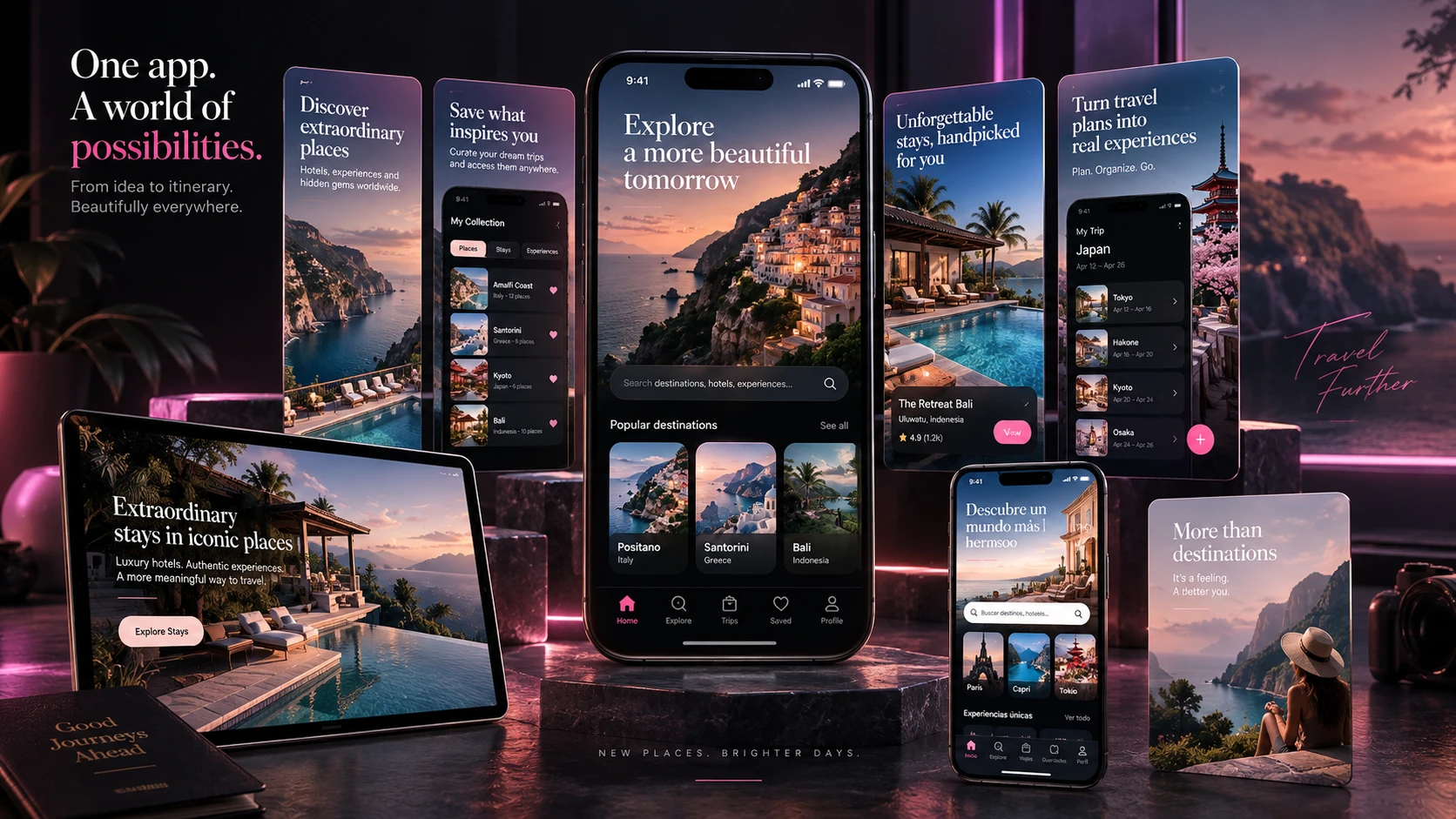
The Store Page Should Feel Like Part of the Product
A strong app-store listing does not feel separate from the application behind it.
The colors belong together.
The typography makes sense.
The product screens feel authentic.
The visual hierarchy is deliberate.
Most importantly, someone seeing the app for the first time can quickly understand what makes it useful.
That is the real role of store screenshots.
They are not simply images around a product.
They are the first chapter of the product experience.
The post From Product UI to Store-Ready App Screenshots: A Better App Screenshot Workflow appeared first on Visualmodo.




0 Commentaires